Context
InstaMed, a J.P. Morgan company, powers a healthcare payments platform that connects consumers, providers, and payers for every healthcare payment transaction.
InstaMed Online for Provider is a cloud-based product that allows providers to manage and track healthcare transactions along with robust reporting tools. In other words, “It’s like PayPal for doctors.” (Except if PayPal also has access to and is completely integrated with the US healthcare system.)
Goal
InstaMed is a leading healthcare billing solution; however, their user interface is hindered by poor navigation and low visibility, resulting in difficulty in completing tasks, and an overall suffering user experience.
As a group of graduate students studying Human-Computer Interaction and Design at UC Irvine, we partnered with InstaMed’s product department to help research and propose a redesign of InstaMed Online as they plan for a future overall of the entire system in the near future.
Timeline
This project was completed for our final capstone project and spanned over six months. Beginning March 2021 and ending August 2021
The Team
Alex Kempf - Design
Alex Pan - Design
Ariel Chen - Research
Sally Kim - Research; Project Manager
Tina Sato - Design
Yusuf Amani (Me) - Design
Alex Pan - Design
Ariel Chen - Research
Sally Kim - Research; Project Manager
Tina Sato - Design
Yusuf Amani (Me) - Design
Contents
1. Research
2. Our Process
3. Design Proposal
4. Delivery
5. The Benefit
1. Research
We began our research by conducting internal stakeholder interviews with executive members of InstaMed’s Product Team, as well as user interviews with current InstaMed customers.
We synthesized our findings along with the results from our expert evaluations (Heuristic Review and Deep Dive into the Industry) to design an interactive prototype which we then used in user testing.
We conducted user testing with the same group of customers we previously interviewed, this allowed us to compare the user’s current experience with InstaMed against our proposed redesigned prototype.
“I have a very hard time getting the information in the way that I want it.” – Quote from customer interview
2. Our Process
The team utilized Figma throughout the brainstorming process. We began by developing a site map to anchor our efforts in improving the overall information architecture. Throughout several rounds of iterations, we proposed an improved site map which include many positive changes such as:
• Nomenclature changes
• Consolidating menus
• Breaking down larger menus
Next, we began sketching sprints for each of the major menus. For each menu item we conducted:
• 30 mins of individual sketching
• 20 mins of presenting our ideas
• 10 mins of consolidating best ideas by placing stars on ideas we liked
• Compiled a list of top ideas based on our rating system.
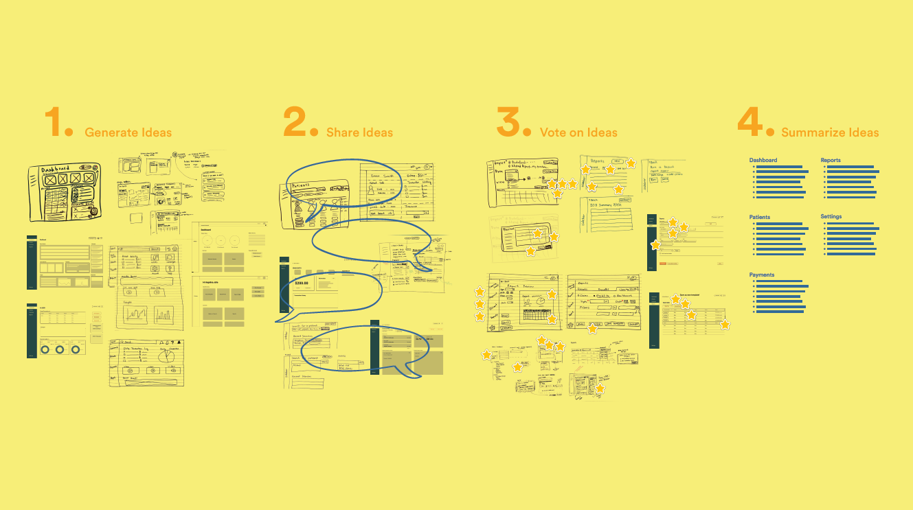
Our Brainstorming Process
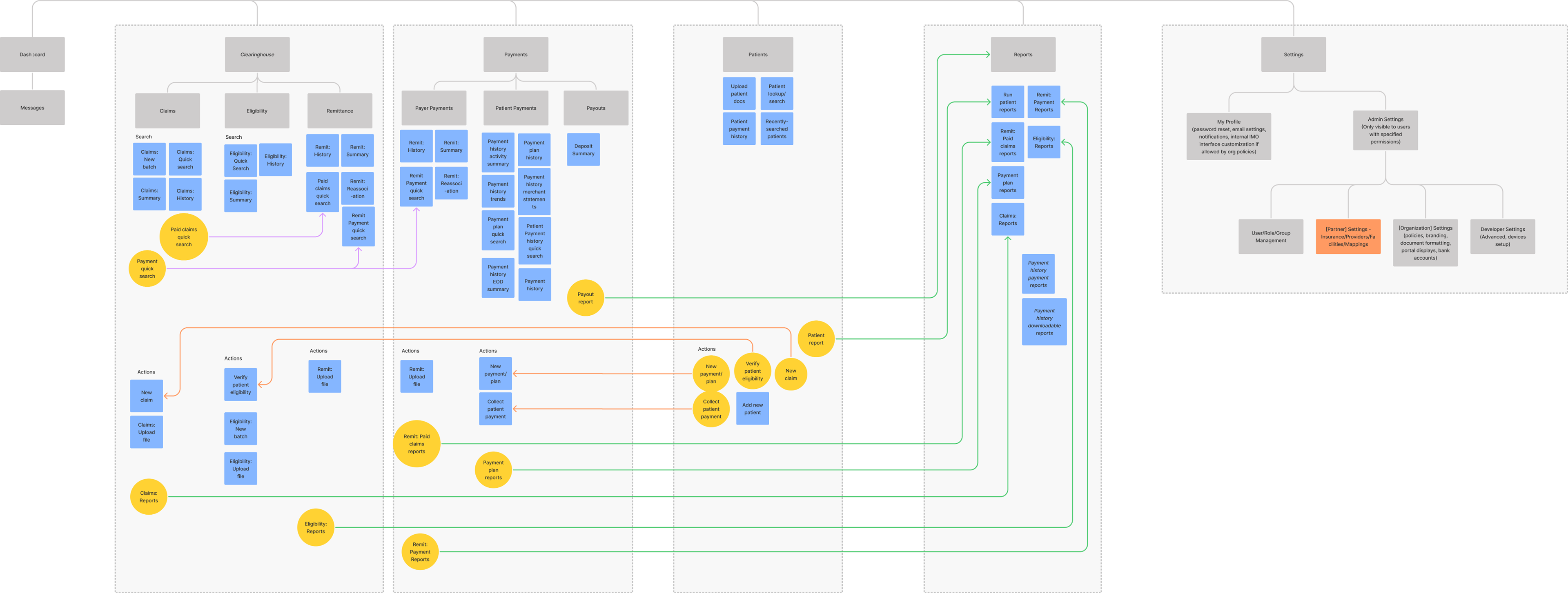
Our Proposed Site Map
3. Design Proposal
Our main objective was to improve discoverability and navigation so that users would be able to accomplish their tasks with minimal guidance and greater efficiency.
Designing a better navigation experience.
1. Consolidating Menus
The current system requires users to navigate between menus simply to accomplish a single task. We propose a menu structure that focuses on the general task by consolidating all actions related to an overall task into a single page as well as developing a universal search function to reduce the use of forms across several pages.
Consolidating Menus
2. Menu Structure and Nomenclature
During user interviews, we found that the previous “Healthcare” menu item was ambiguous for infrequent users. User testing revealed that, even among power users, the word “Clearinghouse” made more sense for the features available within it. We also changed “Configure” to “Settings” to reduce system jargon and separating out Settings and Logout buttons helped to improve the visual hierarchy
3. Consolidating Reports
Our expert reviews revealed the redundancy of having separate reports functions for every individual menu. Given that one of InstaMed’s greatest strengths is the robustness of its analytics and reporting capabilities, consolidating Reports into a dedicated menu item for all types of reports increases the visibility of the tool to users.
4. Actionable Dashboard
One of the greatest difficulties infrequent users face is the difficulty of orienting themselves in an unfamiliar system. We propose a new home screen in the form of an actionable dashboard that allows for the ability to gain a comprehensive overview of the user’s practice, but more importantly, the ability to quickly get started with whatever task the user set out to accomplish through features like “Frequent Tasks”.
Developing a better Visual Design
We developed a style guide as an additional suggestion for the proposed interface designs. we aimed to stay within the realm of possibility for InstaMed’s existing brand but also introduce additional colors to the palette as well as interface elements more reminiscent of contemporary trends.
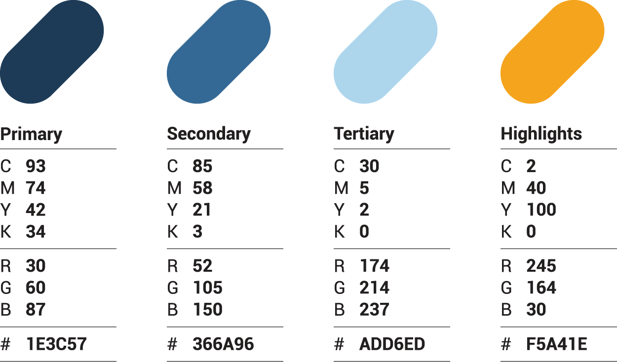
Brand Colors
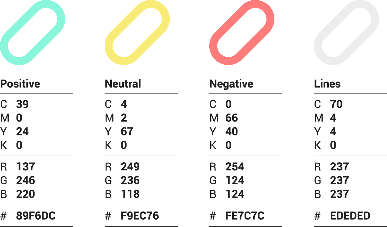
Other Colors
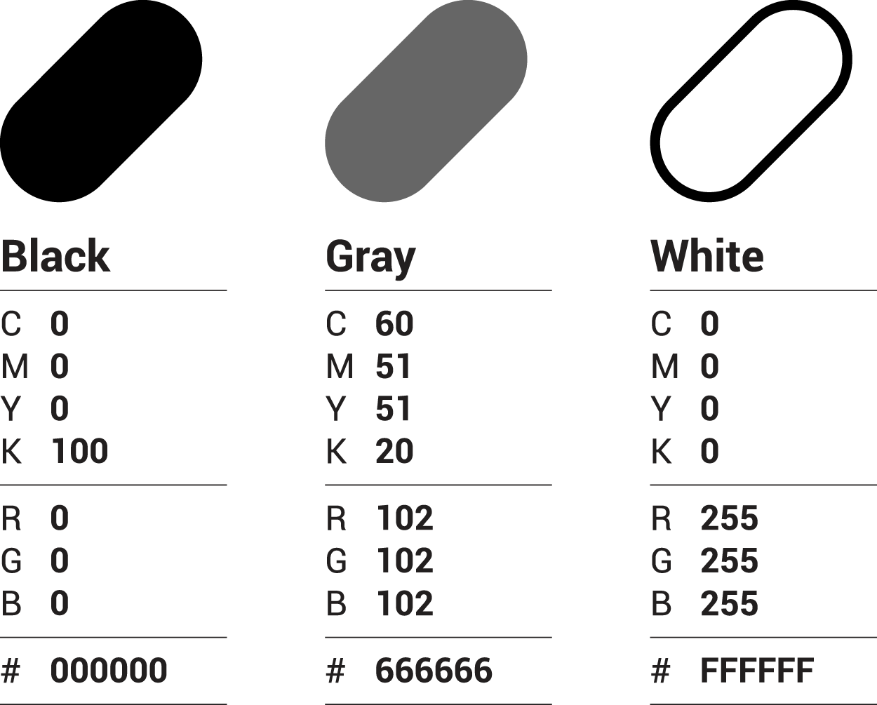
Font Colors
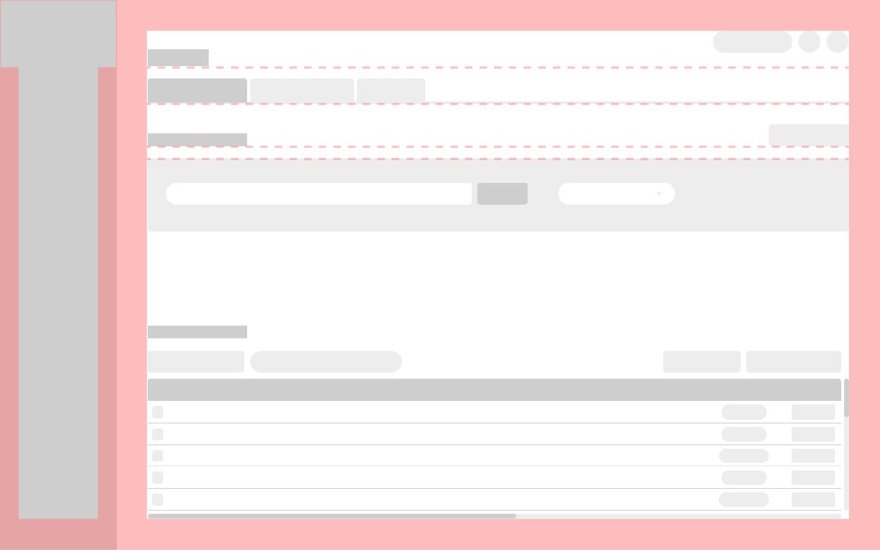
Tab Layout
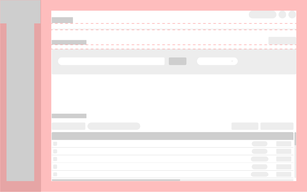
Tabless Layout
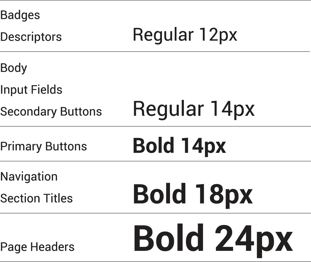
Font System
4. Delivery
Our team compiled a final report for our clients that contain research findings, insights, and redesign recommendations.
5. The Benefit
Upon implementation of our design recommendations, InstaMed can expect to experience the following benefits:
Increase Revenue
Optimizing customer workflows will result in more profit for InstaMed
More Customers
Improving the user experience will lead to happier existing customers and higher conversion of new customers.
Solidifying Marketspace
Revamping the visual design and navigation will solidify InstaMed's position in the market and give them a competitive edge against current and future competitions in the medical billing space.